WHAT?
Responsive web design (RWD) is an approach to web design aimed at crafting sites to provide a most favorable viewing and interaction experience across a wide range of devices (from desktop computer monitors to any mobile devices; Reference: Wikipedia ) In simple words, Responsive web design means a design that adapts to its environment.
WHY?
The popularity of the use of different sizes of devices is increasing ever since. The use of mobile devices to browse the internet accounts the half of the total users all over the globe. Increasing mobile users have made it imperative to design websites that exclusively fit these different sizes, which is highly tedious. Hence, the development should be done in such a way, that the website should fit big or small any screen with minimal differences and alterations.
HOW?
Responsiveness is the ability to read and navigate with ease provided minimum resizing, less scroll and minimum panning. Now the question is, HOW to do this with minimum efforts while making the design pixel perfect?
Responsive website design uses fluid to adapt to the container along with that it uses, proportionate grids, flexible images and CSS3 media queries.
The fluid or liquid concept uses percentage instead of pixels that is otherwise used in fixed concepts. The advantage is that you do not have to think about the device size; setting a percentage view will make it fit perfectly, the design will adapt to the size of the device on its own.
Flexible images are sized in relative units to avoid them from spreading outside the container while development.
Media queries judge the capability of the device. They help the website to adapt according to the device and its requirements such as width and height of viewport & device, orientation (landscape or portrait mode of the device), resolution et al. to make the design look perfect.
Adaptive and responsive is often misused and used as synonyms but they are not. There is a difference between fixed, fluid and responsive web-development.
Adaptive websites use media queries to target specific media i.e. device sizes, monitors, mobile device screens, etc. whereas, responsive websites are built with the fluid to adapt to the environment element easily and use media queries to control the resizing in accordance with the device or browser.
Conclusion
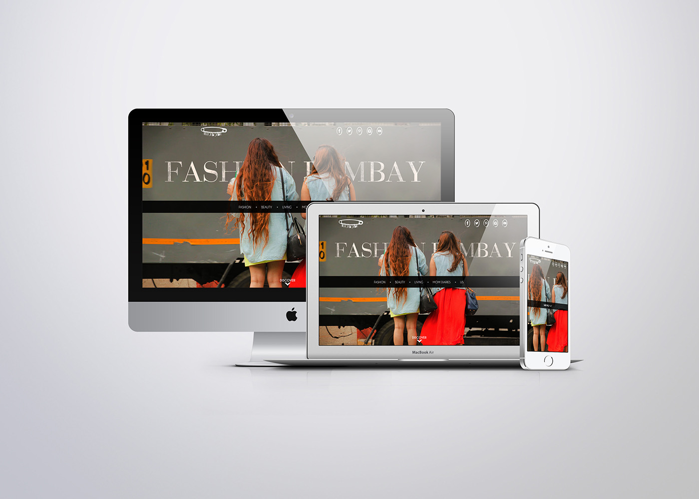
A responsive website is a fundamental shift towards how we’ll design our websites for decades to come. Infinista Concepts has already recognized the shift and delivers every website with pixel perfect responsiveness. All the websites we’ve designed and developed are perfectly responsive to every shape and size of the device. Here’s one we love:
We can brag about ourselves, can you? If yes, talk about it the comments below…
look a like
4 Programming Languages that are Worth Learning
May 30, 2017Web Design
7 Web Development Trends For 2017 And Beyond
November 10, 2016Web Design